
What does the indicator show us today?
The North West region previously held the largest proportion of UTLAs in the upper left-hand area of the hotspot indicator, however the North East has begun to emerge as one of the next regions to monitor as several UTLAs are showing the tell-tale signs of a building problem as they make a sharp ascent up the Hotspot Indicator.
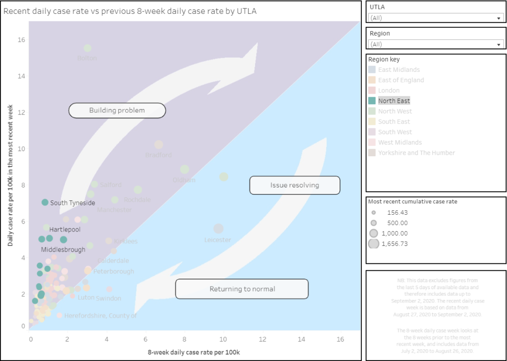
Looking at the trend of Leicester and Bolton, we can see the early potential signs for South Tyneside, Wirral, Gateshead, Hartlepool and Kensington and Chelsea which show vertical increases over a period of at least 5-7 days.
Supporting the Covid-19 response through monitoring
The review of events in Leicester suggests actions were delayed and too many different sources of data were not shared may have delayed intervention. To ensure any outbreak is swiftly dealt with, it is vital that authorities have the information to hand to quickly see whether a rise in cases is an indication of a new outbreak.
Dr Foster’s Covid-19 Hotspot indicator uses simplified Public Health England information to enable Upper Tier Local Authorities (UTLAs) to monitor their local situation, acting as an early indication system. By measuring how the daily case rate compares to the eight-week daily case rate, the indicator uses a trajectory which can show if an increase in caseload is a real rise or a one-off.
Continuous monitoring of the graph helps local authorities to see the effect that implementing restrictions has on case rate. Public health officials can also use evidence from the graph to show that they are returning to national average levels.
The UK COVID-9 Hotspot Indicator excludes figures from the last 5 days of available data.
Lab-confirmed case counts and deaths are reported daily by Public Health England. More information available at https://coronavirus.data.gov.uk.
Population data from Office for National Statistics (ONS) 2018 mid-year population estimates.