
UK Coronavirus Tracker
06 Apr 2020
06 Apr 2020
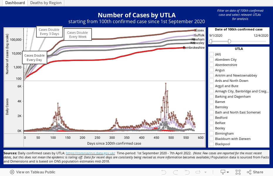
The interactive graph allows individuals or healthcare organisations to compare the rate of change by a number of reference lines and to visualise case number trends by UTLAs nationally or in and around a locality. The graph can be adjusted to provide analysis on a specific date and lines have been plotted on the graph to indicate where the rates for cases doubling every day, every three days and every week would fall.
Get the latest insights and updates from Telstra Health UK.
View now