
COVID-19: Regional Analysis and Impact on Care Services
27 Mar 2020
27 Mar 2020
Individuals infected with COVID-19 may be asymptomatic or have flu-like symptoms including a fever, cough, shortness of breath, fatigue and muscle pain. The usual incubation period between infection and the display of symptoms is 1-14 days. Development of the disease may lead to more severe respiratory diseases such as pneumonia and acute respiratory distress syndrome, which can also result in sepsis and death.
Out of those infected, the elderly and immunocompromised are most vulnerable to more severe conditions brought about by the disease. The disease is more severe among elderly patients and among comorbid patients, particularly those with a history of respiratory illnesses.
Dr Foster have analysed available data relating to COVID-19.
The objectives are:
1. To show the spread of the disease across England and the UK,
2. To identify regions most at risk of developing severe cases of COVID-19,
3. To identify trends and monitor the spread of the disease across the UK,
A detailed description of the analyses is provided in this commentary.
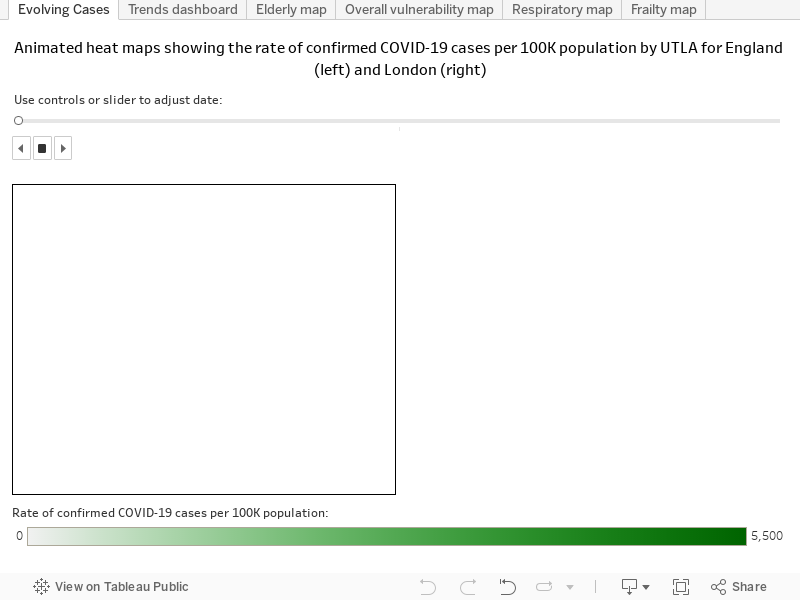
The animation that corresponds to the image below shows how COVID-19 has spread across England (left) and London (right) over time.
It highlights that the disease is spreading rapidly, particularly in London, with the highest rates observed centrally and spreading outwards. Between 7 and 24 March 2020, Kensington and Chelsea are consistently found to have the highest rate of confirmed cases per 100,000 people residing in the area.
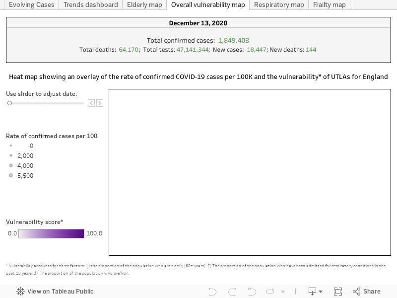
This analysis identifies regions in the UK at Upper Tier Local Authority (UTLA) level most vulnerable in terms of developing more severe cases of COVID-19, which might place pressure on the local health services in the region. The vulnerability score of an area is based on:
The ‘risk’ of an area is based on:
A heat map showing the vulnerability of regions is overlaid with the rate of confirmed COVID-19 cases[3] per 100,000 people residing in an area. Monitoring the rate of COVID-19 cases in the more vulnerable regions could be vital to avoid overwhelming the hospitals in these regions and to avoid deaths.
People who are elderly, frail or have a history of respiratory diseases are more vulnerable, and if infected, would have a higher probability of an admission to hospital and likely have more severe symptoms.
Based on these vulnerability scores alongside the rate of cases, Torbay, Cumbria, Stockport and Tameside should be closely monitored – these areas have been identified as being in the top 30 most vulnerable regions and have higher than average rates of COVID-19 cases compared to the national average (as of 23 March 2020) (Figure 1).
Other vulnerable regions which should be closely monitored are Blackpool, Sefton, Wirral and Knowsley who have been identified in the top 5 most vulnerable regions.

The following maps visualise the above data.
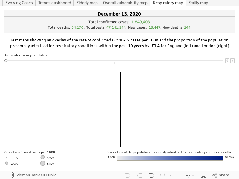
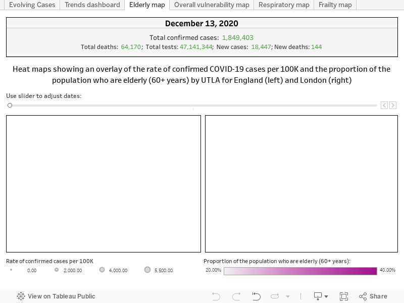

Blackpool is identified as most vulnerable, having 26.45% of the population of the age of 60 years or above. The region has a comparatively high proportion of patients who have been admitted for respiratory conditions (14.86%) and a relatively high proportion of frail (4.79%).
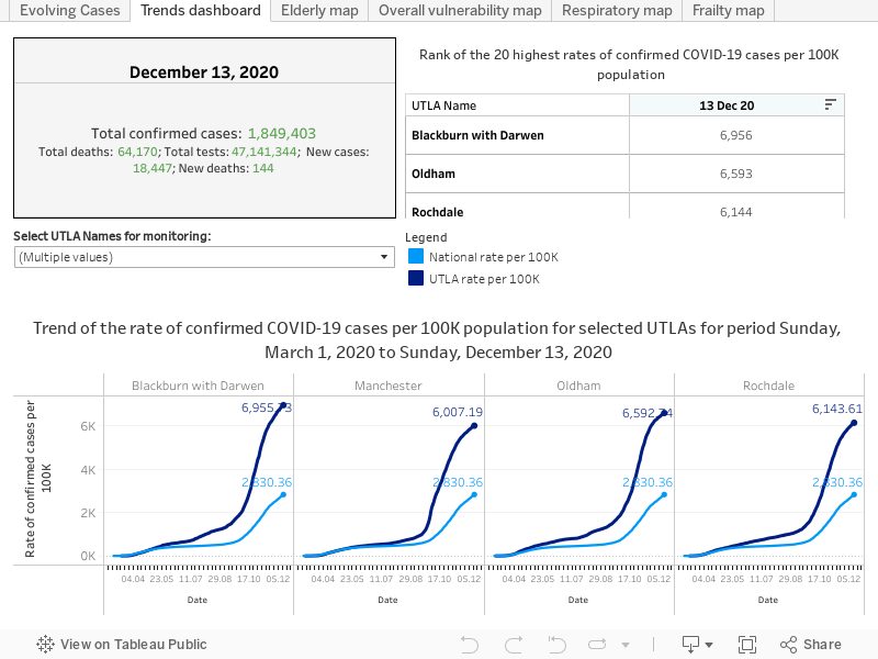
The following dashboard presents trend curves of the rate of confirmed cases by UTLA alongside the national rate. To the left, the table shows the top 20 UTLAs having the highest rate of cases per 100K population based on the most recent data.
Specific up to 23 March:
The national rate shows an exponentially increasing trend. Out of all UTLAs in England, Kensington and Chelsea has the highest rate of confirmed cases, substantially more than the national average. The rate of confirmed COVID-19 cases per 100K population in Kensington and Chelsea is 54.42, which is 5.5 times the national average.
Get the latest insights and updates from Telstra Health UK.
View now